Litmus Redesign

Litmus helps companies unlock their siloed industrial data, activate it efficiently, and scale operations rapidly – powered by the most complete Industrial DataOps platform.


As a UX designer at Litmus, my primary responsibility is to ensure that the products I work on are user-friendly and provide a positive experience for the end users. I conduct research to understand the needs and preferences of the target audience, create wireframes and prototypes to visualize and test different design solutions, and collaborate with cross-functional teams to align the design with business goals and technical feasibility. I also conduct usability testing to gather feedback and iterate on the designs to continuously improve the user experience. My goal is to create intuitive and engaging designs that not only meet the users’ needs but also delight them. The following wireframes are just an example of what I do at Litmus as a UI/UX designer!

Click to see image in full size

catalog Tile View

Old Design

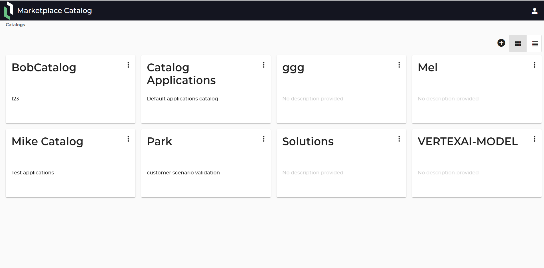
Pain Points
1. The actions (“Delete” & “Edit”) are under ellipsis and users need to click on the icon to see them. (Unnecessary click)
2. There are many white spaces that can be used to show the actions right on the cards.
3. There is no main CTA (Call to action) on the cards and users do not know where to click to start.
4. The “Add” button only comes with icon and it has a different style than the “Add” buttons on other pages.
5. The “Tile View” and “List View” toggles do not have proper labels, they just have the icons.
6. There is no search bar on this page. In case we have 100 catalogs, it is difficult to find a specific catalog without a search feature.
7. There is no way to differentiate “Primary” and “Secondary” catalogs on this page.
8. As there is no pagination on this page, if there are 100 catalogs, users need to scroll down to see them all and the list can be very long.

Click to see image in full size

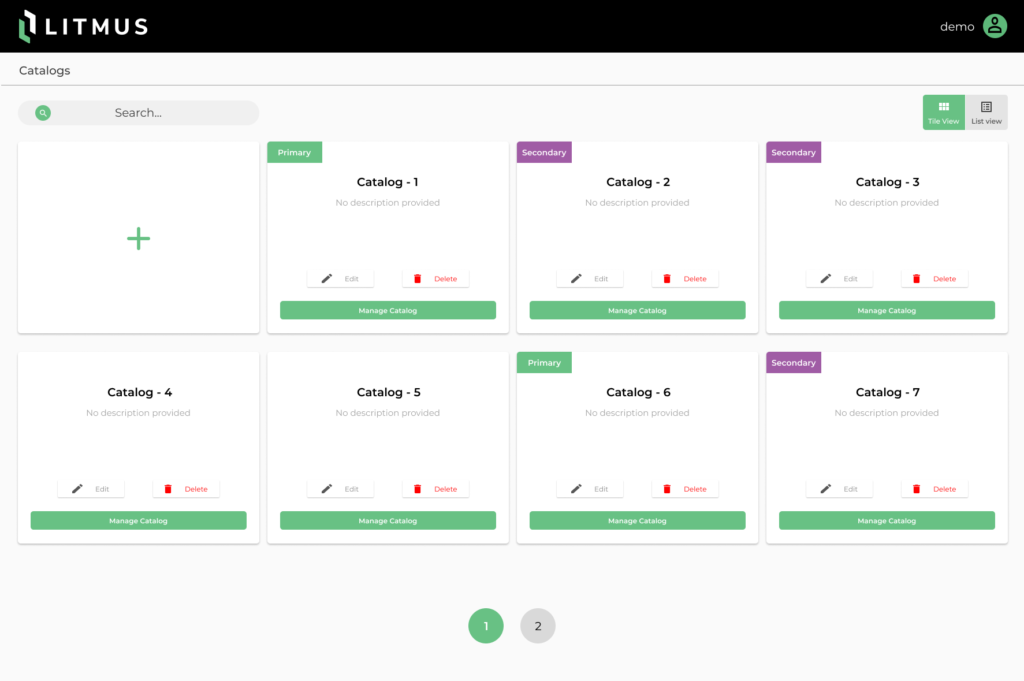
Catalog Tile view

New Design First Iteration

Changes
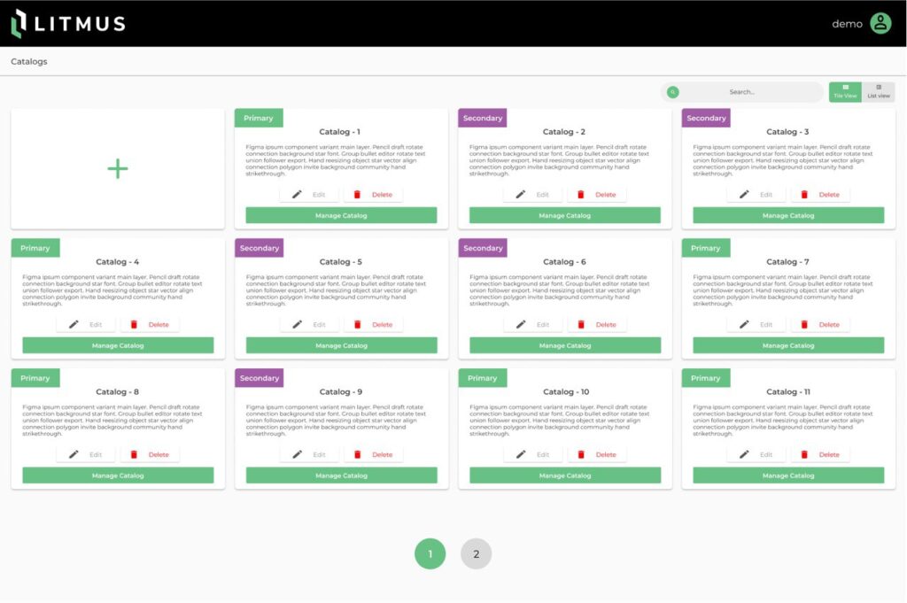
1. The actions are out of ellipsis and are placed on the cards so users see them on the cards right a way and they are not hidden under the ellipsis icon any more.
2. A main call to action with a label “Manage Catalog” is added on the card to reduce the confusion for the users where to click.
3. The “Add” icon is changed to a big add button, so it is easier for the users to see it as the main call to action on this page. It also has the same design with the other “Add” buttons on the other pages in product.
4. Proper labels are added next to the icons for “Tile View” and “List View”, so users would understand the purpose of these toggles right a way.
5. A search bar is added on this page, so finding a specific catalog among many catalogs is easier now
6. There is a banner with different colors to differentiate “Primary” and “Secondary” catalogs.
7. A pagination has been added to this page so it shows a specific number of catalogs on each page and users do not need to scroll down to see all the catalogs on one page.

Final Iteration

Click to see image in full size

Although all the pain points were addressed in the first iteration, the stakeholders still wanted to have more impacted design with smaller cards so more cards can fit within each page.
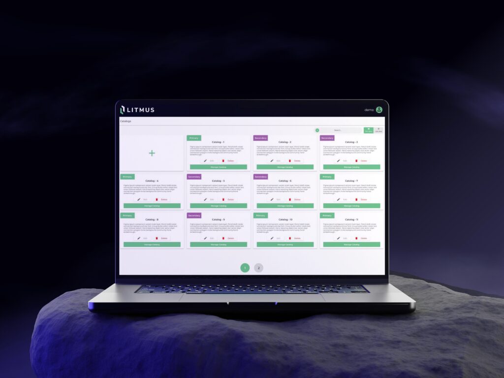
1. The cards are smaller in the final design but there is still enough space to have 250 characters for the description, catalog name, banner, and three buttons for the actions.
2. The spaces between cards and the toggles and search bar are less in the final design so it helped to reduce the overall whitespace on the page.
3. The search bar and toggles are now next to each other to reduce unnecessary eye movements.
Eyecatching CTAs

Less unnecessary clicks and eye movements

Less white space

Useful features like paginations, search bar & banners

Scroll to Top